Why visualise urban data: a guide for planners

Urban planners and developers are drowning in data. Sensor feeds, demographic surveys, traffic counts, land use records — the volume is staggering. Yet raw data alone rarely drives better decisions. Knowing why visualise urban data matters is the first step to changing that. When numbers stay locked in spreadsheets, patterns stay hidden, stakeholders stay confused, and projects stall. This guide breaks down the concrete benefits of urban data visualisation, the cognitive principles that make it work, the technologies enabling it today, and the practical steps you can take to put it into practice on your next project.
Why visualise urban data: the core benefits
The case for visualisation is not theoretical. The role of data visualization in urban development is measurable and well-documented, and the numbers are difficult to ignore.
Evidence-based dashboard design has been shown to deliver a 44% reduction in rework after analysis, and cuts the average number of stakeholder alignment iterations by 3.1. Think about what that means on a large mixed-use regeneration scheme, where every iteration adds weeks and significant cost. Visualisation does not just make data prettier. It fundamentally changes how quickly and confidently decisions get made.
The benefits for urban professionals include:
- Faster stakeholder alignment. Visual narratives communicate spatial complexity far more efficiently than written reports or raw tables. A choropleth map of deprivation indices tells a ward-by-ward story in seconds that a spreadsheet cannot tell at all.
- Improved space utilisation. Real-time data integration delivers 34.2% better space use efficiency and nearly 29% improvement in pedestrian flow, translating directly into better-performing public realm designs.
- Reduced errors in analysis. When planners and developers can see data relationships visually, they catch anomalies and contradictions far more readily than when reviewing raw outputs.
- Stronger public and political engagement. 3D visualisations of proposed schemes allow non-technical stakeholders to grasp massing, scale, and impact without needing to interpret drawings or plans.
“Visualisation turns data from a technical artefact into a shared language. That shift alone changes the quality of every conversation in a planning process.”
The importance of visualising urban data is therefore not a soft argument about aesthetics. It is a hard argument about project outcomes, approval timelines, and professional credibility.
Design principles that make visualisation work
Understanding how to visualise urban data effectively requires more than selecting a chart type. It requires understanding how the human brain processes visual information.
Preattentive attributes are visual properties the brain processes before conscious thought kicks in. Colour, size, orientation, and position guide attention instantly, which means a well-designed dashboard can direct a senior planner’s eye to the most critical insight within a fraction of a second. Visual design, in this sense, is an engineering discipline, not a decorative one.
Chart selection matters enormously. Mismatched chart encodings increase error rates in comparative judgements by up to 62%. Choosing the wrong chart does not just look unprofessional. It actively misleads users. Conversely, correct chart choice means users complete analytical tasks 3.2 to 5.7 seconds faster, which compounds significantly across a team working with data daily.
| Data relationship | Recommended chart type | Why it works |
|---|---|---|
| Change over time | Line chart | Position on a common scale is perceptually precise |
| Part-to-whole | Stacked bar chart | Length encoding outperforms angle (avoid pie charts) |
| Spatial distribution | Choropleth or dot density map | Geographical context is immediately meaningful |
| Correlation between variables | Scatter plot | Reveals clustering and outliers without distortion |
| Ranking or comparison | Horizontal bar chart | Easy to read labels; length is highly accurate |
| Flow or movement | Sankey or flow diagram | Communicates volume and direction simultaneously |
Progressive disclosure is another principle worth building into every urban dashboard you design. Rather than presenting all layers of a dataset at once, progressive disclosure reduces cognitive load by approximately 37%, allowing users to drill into complexity only when they need it. Start with headline KPIs. Let users interrogate underlying data on demand.
Pro Tip: Place your most critical KPIs in the top-left quadrant of any dashboard. Eye-tracking studies confirm that users scan in F or Z patterns, meaning the top-left position receives disproportionate attention. Your most urgent insight should be there.
A common pitfall is over-animating dashboards to make them look impressive. Animation adds cognitive load without adding information. Reserve motion for transitions that genuinely show change over time, and keep everything else static and clean.
Technologies powering urban data visualisation
The best practices for urban data visualisation have evolved considerably as the underlying technology has matured. Three categories of technology now define what is possible for urban professionals.

Multi-modal data fusion and edge AI. Modern urban environments generate data from traffic sensors, air quality monitors, CCTV systems, social media feeds, and building management systems simultaneously. Multi-modal fusion platforms aggregate these streams in real time, while edge AI processes data close to the source, reducing latency. The result is a live picture of city behaviour that planners can interrogate as conditions change, not a week after the fact.
Digital twin platforms. A digital twin is a living simulation environment that mirrors a real city or district. Urban planners can test interventions digitally before committing resources. Adjusting a junction layout, rezoning a block, or modelling the shadow impact of a proposed tower all become low-risk, high-speed exercises. Digital twin platforms integrate live data streams, enabling near-instantaneous decision-making that static GIS simply cannot support.
Interactive dashboards with cross-filtering. The most effective dashboards allow users to select a variable in one panel and see all other panels update in response. This cross-filtering capability lets a planner ask: “What does pedestrian density look like in zones with high retail vacancy rates?” without writing a single line of code. The answer appears visually, in seconds.
Key capabilities to look for when selecting tools include:
- Real-time data connectivity with sensors and external APIs
- 3D and 4D visualisation support for temporal project phasing
- Line-of-sight and shadow analysis for built environment assessment
- Noise impact simulation layers for mixed-use projects
- Mobile-accessible interfaces for site and public consultation use
GeoAI and interactive visualisation have become integral to managing urban socio-environmental systems dynamically. Platforms that combine spatial data with AI-driven pattern recognition allow urban professionals to move from describing what happened to predicting what will happen.
Pro Tip: When evaluating platforms, test whether an effective dashboard answers your core question within five seconds without training. If it takes longer, the interface design is working against you.
How to implement urban data visualisation in projects
Knowing why urban data matters is one thing. Putting it into practice requires a structured approach. The following steps reflect what works across urban planning and development contexts.
- Audit your current data sources. List every data source your team currently uses: GIS layers, survey results, transport models, demographic data. Identify gaps where sensor coverage is missing or where data is collected inconsistently.
- Define the decisions your visualisations need to support. Each dashboard should be designed around a specific set of questions. A transport planning team needs different views from a housing delivery team. Generic dashboards serve nobody particularly well.
- Select appropriate tools and frameworks. Match your tool choice to your team’s technical capability and your data infrastructure. Urban planning software with real-time data varies considerably in complexity. A 3D city planning platform may suit strategic development work, while a lighter dashboard tool may suffice for reporting.
- Design for mobile and non-technical users. Public consultations and political briefings happen outside the office. Any visualisation intended for stakeholder engagement must be legible on a tablet or smartphone, without requiring explanation.
- Build in feedback loops. After each use of a dashboard or visualisation, gather structured feedback from users. Which views were most useful? What questions went unanswered? Use this to refine the interface and data priorities over time.
- Test for accessibility. Colour alone should never be the sole encoding channel. Use shape, size, or labelling in combination with colour to accommodate colour-blind users and maintain clarity in black-and-white print.
Traditional methods vs. visualisation-enhanced planning
Understanding the gap between conventional and modern approaches makes the argument for change concrete.
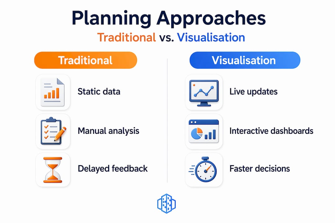
| Feature | Traditional GIS and manual methods | Visualisation-enhanced planning |
|---|---|---|
| Data currency | Static, often weeks or months old | Real-time or near real-time feeds |
| Stakeholder communication | Technical reports and 2D maps | Interactive 3D models and dashboards |
| Decision speed | Slow. Multiple review cycles required | Faster. Visual consensus accelerates sign-off |
| Error risk | High. Spreadsheet interpretation is error-prone | Lower. Visual anomalies are immediately apparent |
| Public engagement | Limited. Few non-specialists can interpret outputs | Strong. 3D renders are intuitive and accessible |
| Project phasing | Hard to model temporally | 4D timelines show phase-by-phase progression |
Static urban models lead to inefficiencies, with interactive 3D approaches reducing miscommunication and speeding up approvals meaningfully. The practical impact on urban data analysis techniques is significant. Teams that make the shift report fewer late-stage design changes, faster planning applications, and more confident public presentations. The benefits of urban data visualisation reach every stage of a project’s lifecycle, from feasibility through to post-occupancy evaluation.
My take on visualisation as a professional necessity
I have reviewed enough urban planning projects to have a clear perspective on this: the teams that struggle most are almost never struggling because of a data shortage. They are struggling because their data is invisible. Numbers buried in Excel files, GIS outputs that only the analyst can interpret, transport models presented as 200-page PDFs. The problem is not what they know. It is that nobody else can see what they know.
What I have seen change when teams adopt proper visualisation practice is not just efficiency. It is confidence. Planners who can show a live 3D model of a proposed scheme to a planning committee carry a different authority than those presenting static elevations. Developers who can demonstrate pedestrian flow projections with real data behind them close conversations faster and more cleanly.
The reluctance I encounter most often is the assumption that good visualisation requires specialist skills that the team does not have. In my experience, modern platforms have largely dissolved that barrier. The learning curve is real, but it is far shorter than the learning curve of continuing to lose weeks to rework and misalignment. If you are still presenting your urban data in tables and static maps, the question is not whether to change. It is how quickly you can afford to.
— Anne
See it in action with 3dcityplanner
If the principles in this article reflect challenges you face on live projects, 3dcityplanner offers a practical way to experience visualisation-driven urban planning directly. The platform combines 3D city modelling, real-time data integration, 4D project phasing, and tools such as line-of-sight analysis and noise impact simulation in a single environment designed specifically for urban professionals.
You do not need specialist technical skills to get started, and a trial is available without upfront payment. Whether you are managing a complex mixed-use development, running a public consultation, or coordinating a multi-stakeholder regeneration project, explore the 3dcityplanner platform to see how live data and interactive visualisation change the quality of your decisions.
FAQ
Why is visualising urban data better than using raw data alone?
Raw data requires interpretation that many stakeholders cannot perform, leading to miscommunication and delayed decisions. Visualisation makes patterns and relationships immediately apparent, reducing errors and alignment time significantly.
What is the role of digital twins in urban data visualisation?
Digital twins serve as living simulation environments that mirror real urban conditions using live data streams, allowing planners to test interventions and model outcomes before committing to physical changes.
How does chart selection affect urban data analysis?
Choosing the wrong chart type can increase error rates in comparative judgements by up to 62%, while the correct chart enables users to complete analytical tasks up to 5.7 seconds faster, according to cognitive engineering research.
What are the first steps to visualise urban data on a project?
Start by auditing your existing data sources, defining the specific decisions your visualisations must support, then select a tool matched to your team’s capability and the complexity of your spatial data.
How does progressive disclosure help with complex urban datasets?
Progressive disclosure layers information so users see headline insights first and drill into detail on demand. Research shows this approach reduces cognitive load by approximately 37%, making complex datasets far more manageable.
Recommended
- Top urban visualisation tools to transform city planning – 3D Urban Development
- How to visualise urban scenarios: a practical guide – 3D Urban Development
- 3D visualisation: a game-changer for urban planning projects – 3D Urban Development
- Urban visualisation: a guide to 3D city planning – 3D Urban Development