Urban visualisation: a guide to 3D city planning

Urban planners and architects have long relied on 2D drawings to communicate complex spatial ideas. Yet flat plans routinely leave stakeholders confused, trigger costly revisions, and slow down approvals. Interactive 3D reduces miscommunication and outperforms 2D in perception accuracy, making the shift from static drawings to dynamic 3D visualisation one of the most consequential decisions a planning team can make. This guide defines urban visualisation, explains how 3D technology transforms project outcomes, compares the main visualisation approaches, and addresses the tools, edge cases, and ethical questions every professional should understand before committing to a workflow.
Key Takeaways
| Point | Details |
|---|---|
| 3D beats 2D | Interactive 3D visualisation outperforms traditional drawings for analysis and communication. |
| Match visuals to audience | Select photorealistic for public and symbolised for experts; hybrid methods work best for group consensus. |
| Mind data quality | Always ensure your models are up-to-date to avoid eroding stakeholder trust. |
| Go beyond technology | Strategic integration and a collaborative mindset are key to unlocking the full value of urban visualisation. |
What is urban visualisation?
To understand why 3D visualisation matters, we first need to define what it actually is. Urban visualisation is the practice of creating digital representations of cities, districts, or individual sites to help planners, developers, and communities understand, explore, and communicate complex spatial issues. It is not simply about producing attractive renders. It is a working methodology that supports every stage of a project, from early concept design through planning applications and public consultations to post-occupancy evaluation.
Visualisation takes several forms, each suited to different purposes:
- 2D maps and plans remain useful for regulatory submissions and land-use analysis, but they offer limited spatial context.
- 3D models add height, volume, and massing, allowing teams to assess how a building sits within its surroundings.
- Interactive simulations layer in data such as traffic flows, solar exposure, and noise levels, enabling real-time scenario testing.
- Digital twins go further still, connecting live data feeds to a continuously updated virtual replica of the urban environment.
The critical distinction is depth of analysis. A 2D plan tells you where something is. A 3D model tells you how it feels to be there. An interactive simulation tells you what happens when conditions change.
“Traditional 2D static representations are insufficient for context and engagement. Digital twins are superior for speed and stakeholder buy-in, but require upskilling across teams.”
For professionals looking to modernise their practice, adopting 3D planning workflows is no longer a competitive advantage. It is rapidly becoming the baseline expectation across the sector.
How 3D technology enhances project planning
With a clear definition in place, let’s see exactly how 3D technology transforms planning outcomes. The gains are measurable and span every phase of a project.
Consider the evidence. GIS-BIM integration reduces flood risk by 30% on complex urban sites. The Nihonbashi digital twin project in Tokyo cut energy use by 99% through real-time simulation. Procedural modelling can sustain 60 frames per second for simulations involving 1,500 vehicles simultaneously. These are not theoretical projections. They are documented outcomes from live projects.
| Application | Technology used | Quantified benefit |
|---|---|---|
| Flood risk modelling | GIS-BIM integration | 30% risk reduction |
| Energy optimisation | Digital twin simulation | Up to 99% energy saving |
| Traffic flow analysis | Procedural modelling | 60 FPS at 1,500 vehicles |
| Stakeholder consensus | Interactive 3D presentation | Fewer revision cycles |
The practical workflow benefits are equally compelling. Here is how most planning teams see 3D technology improve their process:
- Concept validation: Massing models identify scale conflicts early, before design investment deepens.
- Regulatory review: 3D submissions give planning authorities richer context, reducing back-and-forth queries.
- Stakeholder engagement: Interactive models allow non-specialists to navigate proposals, building genuine understanding rather than passive acceptance.
- Risk analysis: Scenario testing for flood, wind, noise, and shadow impacts replaces expensive physical prototypes.
- Construction coordination: 4D timelines link model phases to schedules, surfacing clashes before they reach site.
Digital twin urban planning platforms function as living simulation environments, allowing teams to test interventions and observe cascading effects across transport, energy, and social infrastructure simultaneously. The digital twins impact on decision quality is particularly notable in large-scale masterplanning, where the cost of a single undetected conflict can run into hundreds of thousands of pounds.
Pro Tip: When presenting 3D models to planning committees, always include a side-by-side comparison with the existing streetscape. Decision-makers respond far more confidently when they can see continuity, not just change.
Types of urban visualisation: photorealistic, symbolised, and hybrid approaches
The type of visualisation you choose makes a difference. Let’s compare the main options.
Photorealistic visualisation renders buildings, landscaping, and public realm with high visual fidelity, mimicking real-world lighting, materials, and human scale. It builds spatial intuition quickly and is particularly effective for public consultations and investor presentations. Laypeople respond to photorealistic imagery because it removes the interpretive effort that technical drawings demand.
Symbolised visualisation prioritises data clarity over visual realism. Colour-coded land-use maps, heat maps showing pedestrian density, and abstract massing models fall into this category. Professionals use symbolised approaches for accuracy and analysis because they strip away visual noise and focus attention on the metrics that matter.
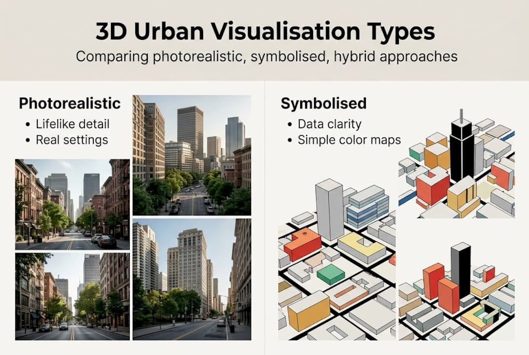
Hybrid methods combine both approaches, overlaying data layers onto photorealistic environments. A hybrid model might show a photorealistic street scene with a real-time air quality index displayed as a colour gradient across building facades. Photorealistic 3D is preferred by laypeople, symbolised models serve expert analysis, and hybrid methods maximise results by serving both audiences within a single presentation.
| Approach | Best for | Strengths | Limitations |
|---|---|---|---|
| Photorealistic | Public, investors | High engagement, spatial clarity | Time-intensive to produce |
| Symbolised | Planners, analysts | Data precision, fast iteration | Low public accessibility |
| Hybrid | Mixed audiences | Broad consensus, fewer revisions | Requires skilled integration |
Audience-tailoring is critical. A symbolised model shown to a community group will generate confusion and distrust. A photorealistic render presented to a GIS analyst may obscure the data they need. Matching visualisation type to audience is as important as the underlying data quality.
- Use photorealistic outputs for planning exhibitions and public engagement events.
- Use symbolised models during technical review sessions and interdisciplinary workshops.
- Use hybrid approaches for governance presentations where both specialist and lay audiences are present.
For a deeper understanding of how these approaches connect to broader digital strategies, the guide to digital twin cities is a useful reference. Practical guidance on producing accurate geometry is covered in this 3D modelling tutorial.
Pro Tip: Before choosing a visualisation type, map your audience. List who will view the output, what decision they need to make, and what level of technical literacy they bring. This single step prevents the most common visualisation mismatch errors.
Tools, edge cases, and ethical considerations
Choosing an approach is important, but only part of the story. Tools, data quality, and ethics deserve equal attention.
The leading platforms for urban visualisation each offer distinct strengths:
- 3D Cityplanner: A browser-based platform with automatic building generation, line-of-sight analysis, noise simulation, and 4D timeline planning. Suited to urban development professionals who need integrated workflows without heavy IT infrastructure.
- ArcGIS CityEngine: A procedural modelling environment that excels at generating large-scale urban models from GIS data. Strong for scenario planning and regulatory analysis.
- SketchUp with MODELUR: A parametric urban design plugin that enables rapid massing studies and density calculations directly within a familiar modelling environment.
These urban planning tools integrating GIS are powerful, but they are only as reliable as the data that feeds them.
Edge cases are more common than many teams anticipate. Data integration complexity, outdated models, and the political use of visuals represent the three most significant risks in practice. An outdated building footprint in a base model can propagate errors across an entire analysis. Semantic mismatches between GIS layers and BIM data create invisible inconsistencies that only surface during construction. Technology equity is also a genuine concern: communities without access to broadband or digital literacy training are systematically excluded from interactive consultation processes.
“Visuals are not neutral. Ethical concerns around persuasive tools influencing equity outcomes are well-documented and must be addressed through transparent methodology and accessible formats.”
Best practice across all three risk areas follows a consistent pattern. Validate your models against current survey data before any stakeholder presentation. Document your data sources and their vintage. Offer multiple output formats, including printed plans and in-person walkthroughs, to ensure accessibility. And critically, review your efficient 3D planning workflow regularly to catch data drift before it undermines trust.
A new mindset for urban visualisation: beyond the tech
The urban planning sector has a tendency to treat technology adoption as the destination rather than the starting point. Teams invest in sophisticated platforms, produce impressive renders, and then wonder why stakeholder outcomes do not improve as expected. The honest answer is that tools do not change culture. People do.
Hybrid approaches reduce revision cycles and boost consensus, but only when teams commit to open dialogue, honest validation, and a willingness to let the data challenge their assumptions. The most effective visualisation workflows we see are not defined by software choice. They are defined by a shared commitment to transparency, iteration, and genuine community involvement.
Urban visualisation is ultimately a collaborative tool. It works best when it surfaces disagreement early, invites scrutiny, and creates space for revision. The digital twins revolution is real, but its value is unlocked by teams that approach it with intellectual honesty, not just technical capability. Invest in training, validate your assumptions, and treat every visualisation as a question, not an answer.
Take your urban visualisation further
Now that you understand urban visualisation’s value, here is how to go further. The gap between knowing the principles and applying them confidently is bridged by hands-on experience with the right platform.
The 3D Cityplanner platform offers urban planners, architects, and developers a fully integrated environment for 3D modelling, noise and line-of-sight analysis, and 4D project timelines, all accessible via browser without specialist hardware. You can trial the platform without upfront payment, making it straightforward to test its capabilities against a real project. For those looking to build a more structured approach, this guide to a streamlined 3D workflow provides a practical framework to get started immediately.
Frequently asked questions
How does urban visualisation differ from traditional planning drawings?
Urban visualisation uses interactive and data-driven 3D models, enabling richer project analysis and public engagement compared to static 2D drawings. 3D visualisation outperforms 2D in stakeholder understanding and significantly reduces miscommunication across project teams.
Which 3D tools are most effective for urban visualisation?
Platforms such as 3D Cityplanner, SketchUp+MODELUR, and ArcGIS CityEngine enable scenario testing, procedural modelling, and project simulation suited to professional planning workflows.
Are there any risks or challenges associated with urban visualisation?
Key risks include outdated models eroding trust, data integration complexities between GIS and BIM systems, and the potential for visuals to be used as persuasive tools that influence decisions unfairly.
Who benefits most from hybrid urban visualisation methods?
Hybrid approaches combining photorealistic and symbolised visuals benefit both technical experts and general audiences, improving consensus and reducing revision cycles across mixed stakeholder groups.