How to visualise urban scenarios: a practical guide

A single misread urban visual can unravel months of planning. In one well-documented case, a mixed-use development in central Europe proceeded through consultation based on rendered imagery that conveyed far greater building separation than the actual scheme provided. Residents approved the project, only for construction drawings to reveal overshadowing impacts that a metrics-linked 3D scenario would have flagged immediately. The resulting redesign cost the developer more than 15% of the project budget. Precise, analytically grounded 3D scenario visualisation is not a presentation nicety; it is a core risk management tool, and this guide walks you through every stage of building one that holds up under scrutiny.
Key Takeaways
| Point | Details |
|---|---|
| Clarity over realism | Metric-centric 3D visuals support better decisions than overly realistic images. |
| Data benchmarking | Use standards like the 3D City Index to ensure robust, scenario-ready city models. |
| Iterative model building | Digital twins should enable scenario testing and before-after analyses, not just visualisation. |
| Validate with metrics | Regularly verify models using empirical indicators and communicate any data uncertainties. |
| Safely leverage AI | When using AI-generated visuals, always validate coverage, accuracy and state what is inferred. |
Defining your visualisation goals and audiences
With the reasons for precise scenario visualisation established, you must first lay a clear foundation for your project by clarifying your goals and knowing your audience.
Every successful 3D scenario starts with a clearly articulated purpose. Are you generating visuals to support internal design iteration, to satisfy a regulatory planning authority, or to facilitate public consultation? Each objective demands a different approach. Design iteration benefits from rapid, low-fidelity models that can be adjusted quickly. Regulatory submissions require geometric accuracy and attribute-rich data. Public consultation often sits between the two, needing enough realism to engage non-specialists without misleading them about impacts.
Understanding the 3D city model benefits available to you shapes how you frame these objectives from the outset. Matching representation style to communication goal is equally critical. A photorealistic render of a proposed tower block can generate emotional rather than analytical responses from community audiences, skewing feedback in unhelpful directions. Conversely, a coloured heat map showing overshadowing across a neighbourhood communicates impact clearly, even to those without spatial literacy.
Key decisions to make before modelling begins:
- Primary purpose: Is the scenario for analysis, regulatory approval, stakeholder communication, or a combination?
- Audience type: Internal design team, planning authority, elected officials, or the general public?
- Visual fidelity level: Schematic and metric-focused, semi-realistic, or high-resolution photorealistic?
- Iteration speed: Do stakeholders need rapid feedback loops, or is a single high-quality output sufficient?
- Comparison framework: Will the scenario be presented alongside a baseline or alternative proposals?
As the urban visualisation guide makes clear, audiences differ significantly. Regulatory panels interpret symbolised data effectively, whereas public audiences may respond more to contextual imagery. Critically, visual realism should be used only when it does not distract from analytical clarity. Applying photorealism to a scenario that requires nuanced metric interpretation is one of the most common and costly errors in professional practice.
Pro Tip: Before you open any modelling software, draft a one-page brief stating the scenario’s objective, the intended audience, the key metrics to be visualised, and the decisions the output must support. Share it with all stakeholders for sign-off. This single step prevents scope creep and misaligned expectations downstream.
Gathering and selecting 3D urban data sources
Once your visualisation goals and intended audiences are clear, the next step is to assemble the right data foundation.

Urban 3D scenario modelling draws on a surprisingly varied data ecosystem. Open national datasets such as those published by Ordnance Survey in the UK or the PDOK platform in the Netherlands provide building footprints, heights, and terrain models at varying levels of detail. Local authority survey data adds granularity at site level. Satellite photogrammetry and aerial LiDAR can be integrated to capture existing building stock and topography accurately. Street-level imagery, sourced from providers such as Mapillary or proprietary surveys, contributes facade-level detail. Crowd-sourced contributions via platforms like OpenStreetMap fill gaps in areas where institutional data is sparse.
However, not all data sources are equal. The key challenge lies in evaluating semantic richness: whether a dataset carries meaningful attributes such as building use, construction date, floor count, or material specification, alongside geometric form. The creating 3D city models workflow explains how these attribute layers drive analytical outputs beyond pure geometry.
Benchmarks for open 3D city data help quantify whether a visualisation stack is likely to support scenario analysis, particularly regarding portal access, model descriptions, thematic content, and semantic richness. Use these benchmarks as a checklist before committing to any dataset.
| Data source | Coverage | Semantic richness | Integration difficulty |
|---|---|---|---|
| National open datasets | High | Medium | Low |
| Local authority surveys | Medium | High | Medium |
| Satellite / LiDAR | High | Low | Medium |
| Street-level imagery | Medium | Medium | High |
| OpenStreetMap | Variable | Low to medium | Low |
Common pitfalls when assembling urban data include mismatched coordinate reference systems between layers, inconsistent level-of-detail standards across neighbouring datasets, and missing attributes in precisely the areas most relevant to your scenario. Plan for a data preparation phase that accounts for these integration challenges before modelling work begins.
Building and configuring your 3D scenario models
With robust, benchmarked 3D data sources in hand, you can confidently move to the practical construction and configuration of scenario models.
A structured workflow prevents errors from compounding through later project stages. Follow these steps:
- Import base data into your modelling environment, ensuring all layers share a consistent coordinate reference system and level of detail.
- Clean and repair geometry by identifying and resolving overlapping surfaces, missing faces, and orphaned vertices that would corrupt analytical outputs such as shadow or viewshed calculations.
- Apply semantic attributes to building objects, linking use class, height, and material data to enable metric-driven scenario comparison.
- Layer scenario variables on top of the base model. This might include proposed new buildings, changed land uses, infrastructure additions, or demolitions, each stored as a separate toggleable layer.
- Configure before-and-after comparison tools to ensure stakeholders can switch between baseline and proposed scenarios cleanly, with metric panels updating in real time.
- Run iterative tests across project lifecycle phases, from early feasibility through to detailed design, refining the model as design decisions solidify.
- Document configuration decisions, noting what has been modelled in detail, what has been simplified, and where assumptions have been made.
The principle of enhancing urban digital twins is most powerful when applied iteratively. Barcelona’s urban modelling strategy, for example, treats digital twins as more than geometry; they are intended to support scenario testing and iterative evaluation across the project lifecycle, not simply to produce attractive images for a planning brochure.
The urban building modelling tutorial offers a practical grounding in the geometric and attribute configuration steps outlined above.
| Configuration step | Common error | How to avoid it |
|---|---|---|
| Coordinate system alignment | Layers shift on import | Lock to a single CRS at project outset |
| Semantic attribute linking | Missing fields block analysis | Audit attribute tables before modelling |
| Scenario layering | Layers overwrite base data | Use non-destructive layer management |
| Comparison tool setup | Metrics fail to update dynamically | Test toggles early with dummy data |
Pro Tip: Configure your scenario model to display at least three metrics simultaneously: a physical impact such as overshadowing, a functional impact such as pedestrian flow, and a regulatory metric such as building height relative to planning limits. This multi-metric view reduces the risk of optimising one variable at the expense of another.
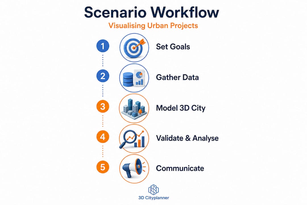
Validating, analysing and communicating your scenarios
Model building is only half the battle; verifying your 3D scenarios and presenting their implications clearly is vital for informed urban decisions.
Validation is where many projects cut corners, often with expensive consequences. A robust validation process for urban 3D scenarios includes checking geometric accuracy against survey data, testing that analytical outputs such as daylight factor calculations or noise propagation maps align with empirically measured conditions, and reviewing whether derived indicators, including occupancy estimates or population proxies computed from 3D models, match known reference data.
Japan’s PLATEAU project provides instructive evidence here. Validation via empirical indicators demonstrates that where visualisation depends on derived metrics rather than directly measured values, systematic error-rate analysis must be built into the workflow. Ignoring this step means your scenario outputs may show confident-looking numbers that are substantially inaccurate.
“City-scale digital twins face structural limitations, particularly around representing social knowledge and complexity. Ensuring visualisation goals align with what the model can genuinely support is not optional.” (City-scale digital twins: challenges for planning)
This caution is particularly relevant when presenting virtual city planning outputs to non-specialist audiences who may interpret a richly detailed 3D model as a guarantee of accuracy rather than a planning tool with inherent assumptions.
Best practice for communicating scenario outputs across different audiences includes:
- For regulatory panels: Lead with metric data, cite data sources and accuracy levels, and clearly distinguish between measured and inferred information.
- For elected officials: Combine schematic visuals with concise impact summaries, avoiding raw figures without context.
- For public consultation: Use comparative before-and-after views with plain-language captions, and flag where the model relies on assumptions.
- For design teams: Provide layer-by-layer access so colleagues can interrogate specific variables without navigating the full scenario stack.
Communicating what the model does not know is as important as communicating what it shows. Audiences that understand the boundaries of a model’s reliability make better, more defensible decisions.
Integrating AI-assisted visualisation and future-proofing your workflow
With core validation and communication strategies in place, leveraging AI can elevate both speed and depth of urban scenario visualisation, if used with due diligence.
AI tools now offer genuine efficiency gains in urban 3D workflows. Facade material mapping, driven by street-level imagery analysis, can populate building models with plausible surface characteristics far faster than manual methods. Gap-filling algorithms can infer building heights or use classes where survey data is absent, enabling scenario modelling to proceed in data-sparse areas. Generative design tools can rapidly produce multiple massing alternatives for a site, supporting early-stage scenario comparison.
However, the critical discipline is knowing where AI inference ends and measured data begins. If you use AI-assisted visualisation inputs from street-level imagery or similar sources, validate coverage, accuracy, and cost, and communicate clearly what is inferred versus what is directly measured. This transparency protects both analytical integrity and professional credibility.
A practical checklist for AI-assisted urban visualisation:
- Coverage audit: Does the AI input cover the full project area, or are there gaps that require manual completion?
- Accuracy benchmark: Has the AI output been tested against a ground-truth dataset to establish an error margin?
- Cost assessment: Is the efficiency gain from AI sufficient to justify the validation overhead it introduces?
- Transparency tagging: Are inferred data points visually distinguished in the scenario output so viewers understand their status?
- Workflow flexibility: Is the AI tool integrated in a way that allows you to swap out its outputs as better measured data becomes available?
Future-proofing your workflow means building it around open standards and modular data structures. Formats such as CityGML and IFC allow scenario models to migrate between platforms as technology evolves. Advanced 3D urban visualisation capabilities are expanding rapidly, and teams that lock themselves into proprietary, closed workflows today will face costly migration challenges tomorrow. Design your data architecture for longevity.
Pro Tip: Maintain a clear metadata log throughout the project that records the source, date, accuracy level, and processing method for every dataset layer. When scenarios are revisited months or years later, this log becomes invaluable for understanding what the model represents and where caution is warranted.
Why analytic clarity should trump visual realism in urban scenarios
Having explained how to future-proof scenario visualisation, let us challenge some widespread misconceptions about realism versus analytic value.
There is a persistent temptation in urban visualisation to invest heavily in photorealism. Clients want to see their city as it will look. Developers want imagery that sells a vision. Planning authorities have grown accustomed to glossy renders in application packages. But the uncomfortable reality is that photorealistic urban scenario visuals frequently mislead rather than inform.
The problem is not the quality of the imagery. It is that realism activates emotional rather than analytical thinking. A richly textured render of a proposed development in warm afternoon light generates a fundamentally different reaction from the same scheme shown as a coloured massing diagram with overshadowing metrics. Both represent the same proposal. Only one of them supports robust, evidence-based evaluation.
Metrics-centric visualisation, where colour scales communicate daylight factors, noise contours indicate acoustic impact, or density gradients show population distribution, communicates planning consequences in a way that lay audiences can interpret correctly. These representations feel less exciting than photorealism, but they produce fewer misjudgements in consultation processes. Symbolised, intentionally non-realistic representations allow stakeholders to focus on the variables that matter for decision-making rather than reacting to aesthetic impression.
Iterative, interactive digital twins that allow scenario comparison, as described throughout this guide, support smarter and more transparent decisions precisely because they make trade-offs visible. A planning team that can toggle between a baseline and a proposed scenario while watching noise or shadow metrics update in real time is far better equipped to make sound recommendations than one relying on a static render.
The urban visualisation best practices principle is clear: deploy realism deliberately and sparingly, reserving it for contexts where emotional engagement genuinely serves the project, such as public realm proposals where quality of place is the primary evaluation criterion. For analytical scenarios, let the metrics lead.
Take your urban scenario visualisation to the next level
If this guide has reinforced the importance of rigorous, analytically grounded 3D urban scenario workflows, the natural next step is to explore tools specifically built for that purpose. The 3D Cityplanner platform brings together automated building generation, line-of-sight analysis, noise impact simulation, and 4D timeline planning into a single, professional environment designed for urban planners, architects, and developers.
Whether you are building a new scenario workflow from scratch or improving an existing one, the 3D Cityplanner platform offers a free trial period so you can test its capabilities against your real project needs without upfront commitment. Explore how urban areas in 3D can be modelled, analysed, and communicated with the precision this guide recommends. The platform’s global building and infrastructure database means you spend less time sourcing base data and more time running the scenario analyses that drive better urban decisions.
Frequently asked questions
What is the difference between digital twins and traditional 3D models for urban planning?
Digital twins support scenario testing and iterative evaluation throughout a project’s lifecycle, making them living simulation environments rather than static representations. Traditional 3D models capture geometry at a single point in time and lack the metric-linked, updateable structure needed for ongoing scenario testing and iterative evaluation.
How can you ensure the accuracy of AI-inferred urban data?
Validate AI-generated inputs for coverage, accuracy, and cost efficiency, and always document clearly what is inferred versus what is directly measured. Transparent labelling of inferred vs measured data protects both the integrity of the scenario and the credibility of its authors.
Why should you use open 3D city data benchmarks?
Benchmarks such as the 3D City Index help ensure datasets carry sufficient attribute richness and thematic content to support meaningful scenario analysis, reducing integration risks significantly.
What are the main limitations of city-scale digital twins?
City-scale digital twins excel at representing physical form and supporting spatial analysis, but they face structural challenges modelling social complexity, community knowledge, and the nuanced realities of lived urban experience.
How can urban scenario visualisation support better decision-making?
Analytically clear, metrics-linked 3D scenarios make planning trade-offs visible and verifiable, enabling teams to evaluate proposals against evidence rather than aesthetic impression, which leads to more transparent and defensible project decisions.
Recommended
- Urban visualisation: a guide to 3D city planning – 3D Urban Development
- Why visualise urban projects: maximise impact with 3D – 3D Urban Development
- Practical guide to modern urban planning with 3D technology – 3D Urban Development
- Top urban visualisation tools to transform city planning – 3D Urban Development