City planning success with data visualisation: 5x faster

City planning has always involved complex trade-offs, but the gap between raw data and confident decisions has never been wider. Dashboards improve decision-making, enable real-time monitoring, and boost citizen engagement in ways that static reports simply cannot match. Yet many planning teams still treat data visualisation as a back-office technical function rather than a frontline tool for stakeholder alignment. This article challenges that assumption directly, offering evidence-backed strategies, practical methodologies, and real-world cases to help you put visualisation to work across your entire planning process.
Table of Contents
- What is data visualisation in city planning?
- The core benefits: decision-making, engagement, efficiency
- Essential methodologies and tools for effective visualisation
- Addressing the challenges: bias, overload, complexity
- From insight to action: practical steps for your city
- Enable next-level city planning with powerful visualisation
- Frequently asked questions
Key Takeaways
| Point | Details |
|---|---|
| Faster, better decisions | Data visualisation simplifies complex information, speeding up and improving key planning decisions. |
| Enhanced collaboration | Visual tools foster engagement and transparency among public stakeholders and planning teams. |
| Evidence-based strategies | Real-time dashboards and mapping support data-driven, adaptable policies in urban development. |
| Mind the limitations | Watch for information overload and accessibility pitfalls when designing urban visualisations. |
What is data visualisation in city planning?
Data visualisation in urban planning is the process of representing complex datasets through charts, dashboards, GIS maps, and interactive graphics so that patterns, trends, and risks become immediately legible. It is not simply about making data look attractive. It is about making it actionable.
Common visualisation types used by planning teams include:
- GIS maps for spatial analysis, zoning overlays, and infrastructure mapping
- Real-time dashboards for monitoring traffic, air quality, and utility performance
- Interactive charts for comparing scenarios, budgets, and demographic shifts
- 3D models and digital twins for simulating development impacts before ground is broken
Each of these formats serves a distinct purpose, but they share a common function: translating raw analysis into a narrative that policymakers and communities can act on. As urban data storytelling combines data analysis, visualisation, and narrative to communicate insights to policymakers and communities, the discipline has moved well beyond spreadsheets.
“Data storytelling is the bridge between what the numbers say and what decision-makers actually do.”
For planning teams seeking a single environment to manage this complexity, integrated visualisation platforms now offer the ability to layer spatial, temporal, and demographic data within one interface, reducing the risk of siloed analysis.
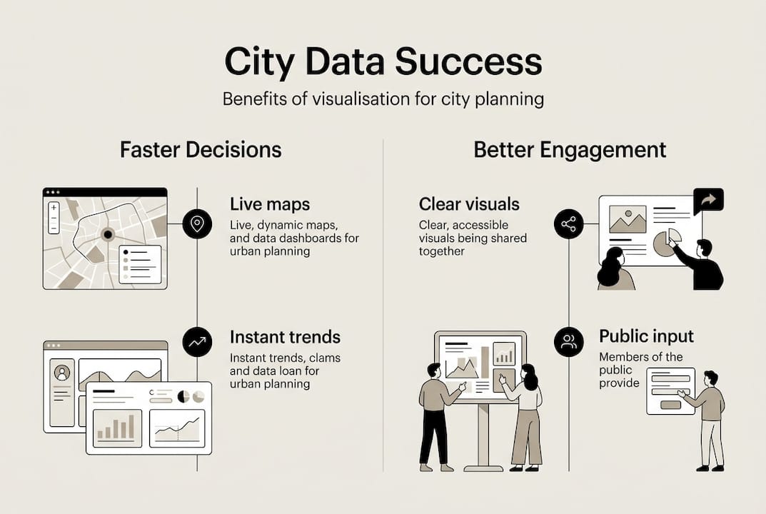
The core benefits: decision-making, engagement, efficiency
Now that we understand what data visualisation encompasses, we can explore its tangible benefits. The evidence is striking. Decision-making is 5x faster with visuals compared to text-based reports, and cities using dashboards have recorded a 30% increase in public participation and a 40% boost in community trust.
These are not abstract gains. Consider the following benchmark cases:
- New York City participatory budgeting used interactive dashboards to increase resident engagement by 30%, making the process more transparent and inclusive.
- Eau Claire transit visualisation supported policy advocacy by presenting route performance data in a format that non-technical stakeholders could interpret and act on.
- IIT-M road safety dashboard translated accident data into spatial maps, enabling targeted infrastructure interventions that would have been invisible in tabular form.
The table below illustrates how visualisation-led planning compares to traditional analytical approaches:
| Outcome area | Traditional analysis | Data visualisation |
|---|---|---|
| Decision speed | Slow, report-dependent | Up to 5x faster |
| Public participation | Low, specialist-led | +30% in benchmark cases |
| Community trust | Moderate | +40% improvement |
| Resource allocation | Reactive | Optimised in real time |
| Transparency | Limited | High, auditable |
For teams managing live projects, real-time visualisation tools make it possible to monitor conditions as they evolve rather than waiting for periodic reporting cycles. Broader urban planning solutions now integrate these capabilities directly into project workflows, reducing the lag between data collection and strategic response.

Essential methodologies and tools for effective visualisation
To achieve these advantages, it is crucial to select the right methodologies and adhere to best practices. The three most widely used approaches in urban planning are GIS mapping, real-time dashboards, and statistical charting.
| Method | Primary use case | Key benefit | Accessibility tip |
|---|---|---|---|
| GIS mapping | Spatial analysis, zoning | Reveals geographic patterns | Use colour-blind-safe palettes |
| Real-time dashboards | Monitoring, KPI tracking | Immediate situational awareness | Limit widgets per screen |
| Line charts | Trend analysis over time | Shows change clearly | Provide data tables for screen readers |
| Bar charts | Category comparisons | Easy to interpret | Label axes clearly |
| 3D models | Development simulation | Communicates scale and impact | Offer 2D fallback views |
To implement these methods effectively, follow this structured approach:
- Define your audience first. A dashboard for elected officials requires different design choices than one built for transport engineers.
- Limit concepts per visual. Best practices consistently recommend focusing each graphic on no more than two or three ideas.
- Use line charts for trends and bar charts for categories, as WCAG 2.1 AA compliance and screen-reader-accessible tables are now considered baseline requirements.
- Apply high-contrast colour schemes and supplement colour coding with patterns or textures to support users with colour blindness.
- Validate your data sources before publishing any public-facing visualisation to avoid misleading stakeholders.
Pro Tip: Resist the temptation to include every available data layer in a single map or dashboard. Overloaded visuals increase cognitive load and reduce the likelihood that any single insight will be acted upon. Two or three well-chosen metrics outperform ten poorly organised ones every time.
For spatial work specifically, GIS software options range from open-source platforms to enterprise-grade systems, and GIS-integrated planning tools now allow planners to combine spatial layers with real-time sensor feeds and demographic data in a single environment.
Addressing the challenges: bias, overload, complexity
However, to unlock the full potential of visualisation, one must also confront its limitations and risks. Visualisation is a powerful tool, but it is not a neutral one.
Key challenges practitioners regularly encounter include:
- Cognitive overload from too many data layers, which can paralyse rather than inform decision-making
- Colour blindness and accessibility gaps, which exclude a significant portion of the population if not addressed at the design stage
- Bias in data selection, where the choice of which datasets to display can inadvertently favour certain communities or outcomes
- Over-reliance on simplified visuals, which can obscure the genuine complexity of urban systems
- Privacy and ethical concerns, particularly when visualisations incorporate individual-level or sensitive community data
Data overload increases cognitive load, and colour blindness requires the use of patterns and textures rather than colour alone. Meanwhile, over-reliance on simplified visuals can mislead decision-makers, reinforcing the need for human-AI hybrid interpretation and multi-source validation.
“A visualisation that simplifies too aggressively is not a communication tool. It is a distortion.”
The solution is not to avoid visualisation but to practise it responsibly. Validate open data sources rigorously, design with audience diversity in mind, and treat every visualisation as a hypothesis rather than a conclusion. For those working with complex system insights, the literature is clear that digital twins and simulation models have real limits when applied to emergent urban behaviours.
Pro Tip: Schedule quarterly reviews of your visualisation workflows. Staff turnover, new data sources, and evolving community demographics all introduce fresh sources of bias. Regular training keeps your team calibrated and your outputs trustworthy.
From insight to action: practical steps for your city
To wrap up, let us distil the best practices into a clear action plan for immediate impact. The following steps are designed to move your team from aspiration to implementation.
- Assess your current data landscape. Identify which datasets you already hold, which are missing, and which are of sufficient quality to support public-facing visualisation.
- Define clear planning objectives. Visualisation without a question to answer produces noise, not insight. Anchor every dashboard or map to a specific decision or policy outcome.
- Select tools appropriate to your team’s capacity. Not every municipality needs enterprise GIS. Start with accessible platforms and scale as your team’s skills develop.
- Design for your broadest audience. Apply WCAG 2.1 AA standards, use accessible colour palettes, and always provide data tables alongside graphics.
- Publish through public portals. Dashboards and public visualisation portals drive accountability and have delivered up to 40% improvements in operational efficiency in documented cases.
- Integrate stakeholder feedback loops. Visualisations should evolve in response to community input, not remain static once published.
- Combine digital tools with human expertise. 3D urban visualisation tools and GIS layer editing capabilities are most effective when guided by planners who understand local context and community priorities.
The goal is not to replace professional judgement with automated dashboards. It is to give that judgement a far richer, faster, and more transparent foundation.
Enable next-level city planning with powerful visualisation
The strategies covered in this article point towards one consistent conclusion: effective data visualisation is no longer optional for urban planning teams that want to make faster, more trusted, and more inclusive decisions.
If you are ready to move beyond static reports and disconnected datasets, 3D Cityplanner offers a purpose-built environment for exactly this challenge. From digital twin city solutions that simulate development scenarios in real time, to collaborative tools that bring planners, engineers, and community stakeholders into a shared visual workspace, the platform is designed to make your data work harder. Explore interactive city planning tools and discover how your team can turn complex urban data into clear, confident decisions from day one.
Frequently asked questions
How does data visualisation improve public engagement in city planning?
Data visualisation makes city plans understandable to non-experts, with benchmark cases recording a 30% participation increase and a 40% rise in community trust when dashboards replace traditional reporting formats.
What tools are recommended for real-time data visualisation in urban planning?
GIS systems such as ESRI, Tableau, and specialised city planning dashboards support real-time visual analysis and scenario testing, provided they are implemented in line with data visualisation standards for accessibility and clarity.
What are the main risks of over-reliance on visualisation?
Over-simplification can lead to misjudgement, and visualisations may introduce bias or distort genuine complexity. The human-AI hybrid approach and multi-source validation are essential safeguards.
How can accessibility be improved in city planning visualisations?
Apply high-contrast colour schemes, supplement colour coding with patterns for colour blindness, provide screen-reader-accessible data tables, and limit each graphic to two or three core concepts in line with WCAG 2.1 AA guidance.
Recommended
- Master 4D planning in urban design for 25% faster projects – 3D Urban Development
- Visualizing the Transformation of Den Haag Zuidwest: A 3D Planning Case Study - 3D Gebiedsontwikkeling
- Urban Planning Software with Real-Time Data Visualization
- Which Urban Planning Solutions Support Real-Time Data Visualization?