6–10 KPIs Dutch Planners Need for Area Development With a Digital Twin

An effective KPI dashboard for gebiedsontwikkeling gives every stakeholder, from project manager to alderman, one reliable view of housing delivery, infrastructure spend, sustainability performance and approval timelines. It needs a named owner and a fixed review cadence, or the numbers rot within a quarter. Platforms such as 3D Cityplanner show how spatial scenario data can feed that same dashboard directly, rather than through a manual export.
TL;DR:Most dashboards should focus on 6 to 10 core KPIs, with clear owners and fixed review cadences, to ensure reliable and up-to-date information.Spatial indicators like development capacity, green space, and visibility are best generated from scenario models such as 3D Cityplanner, avoiding manual estimation.Data sources must be live or regularly updated systems, with timestamps and provenance to prevent stale metrics and ensure dashboard trustworthiness.Visual design should prioritize simplicity, consistency, and spatial mapping to help stakeholders quickly grasp key project statuses without information overload.Assigning clear ownership and establishing specific thresholds for KPI deviations helps maintain governance and prompt action when targets are missed.
3D CityplannerMake Spatial Decisions With Confidence3D Cityplanner helps you analyse and compare urban development scenarios using spatial data, 3D models and project calculations.Explore 3D Cityplanner
Table of Contents
- What is a KPI dashboard for area development?
- Which KPIs should a gebiedsontwikkeling dashboard track?
- Where does the data come from, and how do you keep it clean?
- How should you design a dashboard people actually read?
- Who should own each KPI, and how often should it be reviewed?
- How does 3D Cityplanner support KPI production in practice?
- What practitioners get wrong about KPI dashboards
- See how a gebiedsscan or demo works with 3D Cityplanner
- Sources
- FAQ
What is a KPI dashboard for area development?
A KPI dashboard for area development pulls the scattered metrics of a gebiedsontwikkeling project, housing units, infrastructure budgets, sustainability targets, permit timelines, into a single, continuously updated interface. It replaces the patchwork of spreadsheets and quarterly PDF reports that most area development teams still rely on. That centralisation is the entire point: a KPI dashboard for area development lets stakeholders compare actuals against targets and prior-year performance without chasing five different departments for numbers.
Not every dashboard should look the same, and choosing the wrong format is one of the most common mistakes in this field. A project team tracking weekly construction milestones needs something entirely different from a council executive scanning quarterly progress before a board meeting.
Three broad types cover most gebiedsontwikkeling needs:
- Tactical/operational dashboards show granular, near real-time data, permits processed this week, cubic metres of infrastructure delivered, contractor milestones hit or missed. Project managers and site coordinators live in these daily.
- Analytical dashboards support deeper investigation: trend lines across quarters, correlation between infrastructure spend and housing starts, scenario comparisons across zoning options. GIS analysts and planning consultants use these to answer “why” questions, not just “what”.
- Executive/strategic dashboards strip everything down to five or six headline indicators with clear red/amber/green status. Aldermen, board members and external investors need a signal, not a spreadsheet.
Categorising dashboards by purpose prevents the two most common failure modes: cluttering an executive view with operational noise, or handing a project team a dashboard too shallow to actually manage against. Match the dashboard to the decision it needs to support, and design backwards from there.
Which KPIs should a gebiedsontwikkeling dashboard track?
Most area development teams do better with 6 to 10 core indicators than with thirty half-tracked ones. The Tableau guide to KPI dashboards recommends defining your audience first, then selecting a tight set of KPIs with clear MTD/YTD targets rather than an exhaustive metric dump nobody actually reads. Below is a practical catalogue grouped by theme, with a note on cadence and likely data source for each.
- Housing delivery. Track housing starts, completions, and percentage of the programme delivered against plan. Measure monthly, sourced from permit databases and contractor progress reports.
- Infrastructure spend and utilisation. Track budget committed versus spent, and infrastructure capacity used versus available (roads, sewage, energy grid connections). Measure monthly, sourced from financial ledgers and municipal asset systems.
- Approvals and schedule adherence. Track average time-to-decision for permits and percentage of milestones hit on the original schedule. Measure weekly to monthly, sourced from permit and case-management systems.
- Sustainability performance. Track carbon intensity per unit built, square metres of public green space delivered, and biodiversity proxies such as tree canopy cover. Measure quarterly, sourced from environmental assessments and, where available, the Nationaal Dashboard Toekomstbestendige Leefomgeving.
- Public value and leading indicators. Track permissions in the pipeline (not yet issued), transport mode share projections, and parking demand versus supply. Measure monthly, sourced from planning applications and mobility studies.
The last category matters more than most teams assume. Lagging indicators, permits actually issued, homes actually completed, tell you what already happened. Leading indicators, permissions still in the pipeline, projected transport mode share under a proposed zoning change, help predict what happens next. A dashboard built only on lagging data will always report bad news a quarter too late.
Pro Tip: Assign each KPI a single named owner before it goes on the dashboard, not a department. “Housing delivery: J. van der Berg, updated monthly” prevents the ownership vacuum that causes most stale metrics.
Where does the data come from, and how do you keep it clean?
The biggest threat to any gebiedsontwikkeling dashboard is not choosing the wrong KPIs. It’s letting the data feeding those KPIs go stale, because manual entry from spreadsheets is the leading cause of dashboard abandonment within twelve months of launch.
Common data sources for area development KPIs include:
- Municipal GIS systems and base registrations such as BAG (Basisregistratie Adressen en Gebouwen) and BRK (Basisregistratie Kadaster).
- Permit and case-management databases tracking application status and decision dates.
- Financial ledgers and ERP systems holding infrastructure and project budgets.
- Sensor feeds for traffic counts, air quality or noise where available.
- National reference instruments such as the Dashboard Verstedelijking and NDTL for benchmarking sustainability indicators against comparable regions.
Two integration approaches dominate in practice. An API-first setup connects live systems directly to the dashboard layer, giving near real-time updates but requiring more upfront engineering. An ETL approach (extract, transform, load) pulls data into a central warehouse on a schedule, typically nightly or weekly, which suits teams without dedicated data engineering resources. Either way, every KPI on the dashboard should carry a visible timestamp, a named data owner and a clear provenance trail. If a figure cannot be traced back to its source system, it should not be on the dashboard.
Tools that integrate cleanly with existing GIS layers reduce this friction considerably, since spatial KPIs, green space per resident, parking capacity, visibility corridors, often live natively in GIS rather than in a financial ledger.
How should you design a dashboard people actually read?
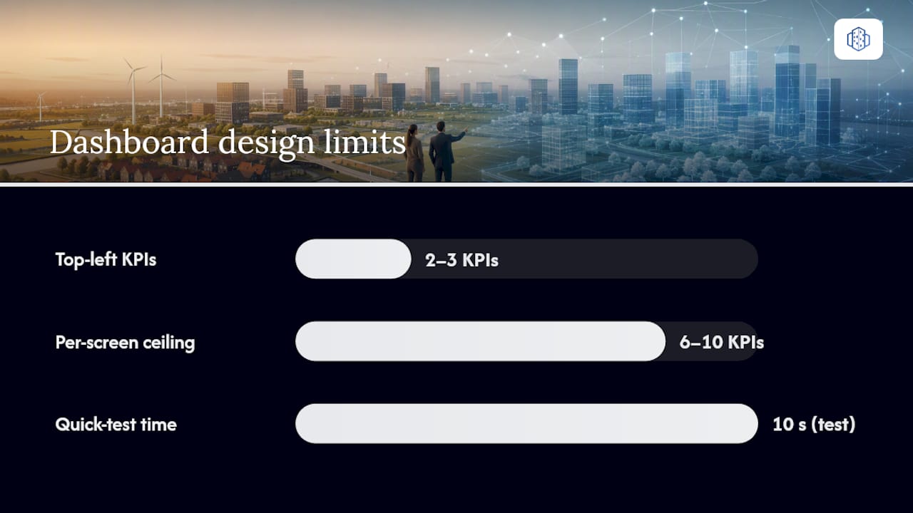
A dashboard that looks impressive in a demo but confuses a busy alderman in a five-minute glance has failed at its actual job. Readers scan in an F-pattern, top-left first, so the two or three KPIs that matter most for a given audience belong there, not buried below the fold.
A few visual rules make the difference between a dashboard people trust and one they ignore:
- Keep KPI density low per view. Six to ten metrics per screen is the practical ceiling before an executive audience starts skimming past everything.
- Use consistent colour semantics throughout: red always means off-target, amber always means at-risk, green always means on-track. Switching conventions between panels destroys trust fast.
- Show simple delta or variance indicators (up/down arrows, percentage change against target) rather than raw numbers alone.
- Put spatial KPIs on a map first, not a table. Development capacity, green space distribution and visibility analysis all read faster as a coloured map layer than as a row in a spreadsheet.
- Build in filters and drill-downs so a district-level figure can be clicked through to project level without leaving the dashboard.
- Always display the data source and last-updated timestamp on every panel, not just in a footnote.
Visual hierarchy, context and interactivity are what separate a dashboard that gets opened once and abandoned from one that becomes the team’s actual working tool.
Pro Tip: Test your dashboard’s top-left corner with someone outside the project team. If they can’t state the single most important number within ten seconds, your hierarchy needs work, not more data.
Who should own each KPI, and how often should it be reviewed?
A dashboard without governance becomes a museum piece within a few months. Someone has to own each number, someone has to check it against reality, and someone has to decide what happens when a KPI drifts off target.
- Assign named owners per KPI cluster, not per dashboard. Housing delivery, infrastructure spend and sustainability metrics rarely sit with the same person, and forcing one owner across all three guarantees neglect somewhere.
- Set differentiated review cadences. Tactical panels (permit processing, contractor progress) deserve weekly or even daily glances by the project team. Strategic panels (programme-wide delivery percentage, budget utilisation) suit a monthly steering-group review.
- Define variance thresholds in advance. Decide, before a project starts, what percentage deviation from target triggers an escalation, and write a short action checklist: who gets notified, what data gets pulled, what decision needs making within how many days.
- Version your KPI definitions. When a metric’s calculation changes (a new way of counting “housing starts”, for instance), log the change and the date rather than silently altering historical data.
- Control access deliberately. Municipal financial data and permit-holder information carry privacy obligations; restrict who can view identifiable records while keeping aggregate KPIs open to the wider project team.
How does 3D Cityplanner support KPI production in practice?
Spatial KPIs, development capacity, green space per resident, parking ratios, visibility impact, are notoriously hard to produce from financial or permit systems alone, because they depend on the physical form of a scheme rather than its paperwork. This is where a browser-based digital twin earns its place in the workflow rather than sitting alongside it as a separate tool.
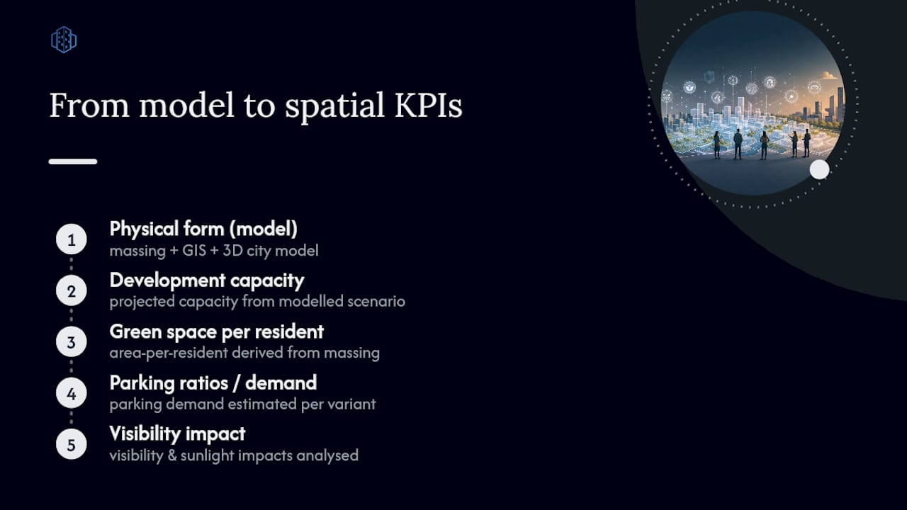
3D Cityplanner combines GIS data, automated area generation and 3D city models so planning teams can generate several of these leading indicators directly from a modelled scenario rather than estimating them by hand. A feasibility study comparing three massing options for a brownfield site, for instance, can output projected development capacity, sunlight hours on adjacent public space, and parking demand for each variant, figures that would otherwise require separate spatial analysis before they ever reached a spreadsheet.
Scenario comparison tools also help produce forward-looking metrics that historical systems simply cannot generate on their own.
Leading indicators for area development, such as projected transport mode share under a new zoning scheme, are often best produced by integrated spatial tools rather than only historical reporting systems.
For stakeholder communication, exportable KPI layers turn a technical scenario comparison into something a council committee or resident group can actually follow: a map-based view of building massing, green space and infrastructure trade-offs sitting alongside the numeric summary, rather than the numbers standing alone.
What practitioners get wrong about KPI dashboards
Most teams overbuild before they underuse. I’ve watched planning teams spend months designing a dashboard with forty tracked metrics, only to have the steering group actually look at three of them each month. Start small: pick your six to ten core indicators, get them flowing automatically, and expand later once the habit of checking the dashboard is actually established.
Automate the data feeds before you polish the visuals. A beautifully designed panel fed by someone’s manual monthly spreadsheet update will die the moment that person changes roles. Tailor visuals to the role: a project manager wants a table with drill-downs, an alderman wants three coloured tiles.
National instruments like Dashboard Verstedelijking and NDTL are useful as indicator libraries, not templates to copy wholesale. Borrow the categories that fit your project’s scale, and leave the rest.
— Anne Dullemond
See how a gebiedsscan or demo works with 3D Cityplanner
3D Cityplanner gives planning teams a browser-based way to turn a modelled scenario into KPI-ready data, no installation, no separate GIS export step, no waiting on a specialist to run the numbers. Where a traditional feasibility study leaves spatial indicators buried in a consultant’s report, a scenario built in 3D Cityplanner outputs development capacity, green space and visibility figures directly, ready to feed the dashboard your team already reviews.
A Gebiedsscan gives municipalities and developers a fast read on a site’s baseline conditions and scenario potential, useful groundwork before committing to a full KPI framework. Planning consultants comparing zoning options, architects testing massing against sunlight and visibility constraints, and municipal teams preparing stakeholder sessions all use the same underlying scenario data differently. If you want to see what a scenario comparison looks like against your own site data, check the pricing and plan options starting from the Starter plan at €79 per month, or request a demo to walk through a live example first.
Sources
For indicator benchmarking, consult the Dashboard Verstedelijking and the NDTL for sustainability datasets. For dashboard design methodology, Tableau’s and Microsoft’s guides on KPI dashboard structure remain solid starting points, alongside project-monitoring examples such as PewnyDeweloper’s development tracking work.
- What is a KPI dashboard? — Domo
- What is a KPI dashboard? — Tableau
- What Is a KPI Dashboard? — Microsoft Power BI
FAQ
What makes a KPI a good one for area development?
A good KPI has a clear definition, a named owner, a fixed measurement cadence and a target it can be compared against. It should also be automatically fed from a source system rather than typed in manually, since manual entry is the most common reason dashboards fall out of use.
Which KPIs actually work for gebiedsontwikkeling projects?
Housing delivery percentage, infrastructure budget utilisation, time-to-decision on permits, and carbon or green space metrics tend to hold up best in practice. Most teams do better with 6 to 10 core KPIs than a long list nobody reviews consistently.
Can I build a gebiedsontwikkeling dashboard myself?
Yes, using a combination of GIS layers, permit-system exports and a visualisation tool, though the integration work to automate live feeds is usually the hardest part. Platforms like 3D Cityplanner reduce that friction for spatial KPIs specifically, since development capacity, sunlight and visibility figures can be generated directly from a modelled scenario rather than calculated separately.
What does a KPI dashboard actually mean in practice?
It means replacing scattered spreadsheets and quarterly reports with one continuously updated view of how a project is performing against its targets. For gebiedsontwikkeling, that typically covers housing delivery, budget spend, approval timelines and sustainability performance in a single interface.
What does 3D Cityplanner cost?
Current pricing runs from the Starter plan at 79 EUR per month up to the Organisatie plan from 9900 EUR per year, with Professional and Team tiers in between. Full details are available on the pricing page.