3D digital‑twin heat‑island analysis: map night risk for planners
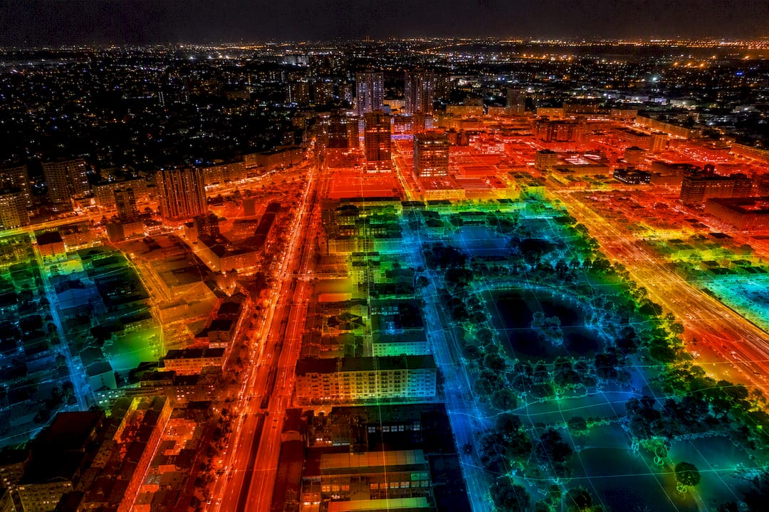
A hitte-eiland analyse maps where a city holds heat longest, quantifies the day and night temperature gap against the surrounding countryside, and identifies which structural factors are driving it. Dutch cities show an average surface urban heat island of roughly 2.9°C by day and 2.4°C at night, rising far higher during heatwaves. Combine satellite land-surface temperature data with PET comfort metrics and a platform such as 3D Cityplanner to prioritise mitigation and pressure-test design scenarios before committing budget.
TL;DR:Night-time urban heat island effects are often more persistent and problematic than daytime peaks due to slow heat release from dense materials.Reducing impervious cover by 10% can lower surface UHI by about 2°C during the day and 1.2°C at night on average, according to TNO studies.High-resolution, multi-scenario modeling and repeated measurements across several years improve the accuracy of heat island assessments and mitigation planning.Local design interventions can significantly reduce PET and local heat stress, but city-wide UHI requires broader structural changes for meaningful impact.Integrating heat analysis early in planning, with tools like 3D Cityplanner, allows testing of mitigation scenarios against site-specific data before finalizing designs.
Table of Contents
- What does a hitte-eiland analyse actually measure?
- How to map hotspots without misreading the data
- Structural drivers your analysis needs to test
- Choosing satellite, in-situ or hybrid measurement methods
- From heat map to risk map: who and what is exposed
- Interventions worth modelling before you build
- What Hofplein and the national TNO study actually show
- Running the analysis as a 3D digital-twin workflow
- Why seasonal timing changes what your data shows
- How land use and vegetation type shape heat intensity
- Heat islands under a changing climate baseline
- Keeping measurements trustworthy: validation and calibration
- Where heat mapping fits in planning policy
- Where heat island research is heading next
- Publisher perspective: build heat analysis into the planning cycle, not around it
- Run scenario comparisons for heat risk inside 3D Cityplanner
- Sources
- FAQ
What does a hitte-eiland analyse actually measure?
A proper heat island analysis separates two related but distinct signals. Surface temperature, captured by satellite sensors, tells you which rooftops, pavements and car parks are radiating heat back at a given moment. Atmospheric urban heat island (UHI), measured at roughly two metres above ground, tells you what people actually feel walking through a street or sitting on a balcony at 11pm. Designers need both: surface data flags material problems, atmospheric data flags comfort and health problems.
Three metrics dominate the field:
- ΔT (urban minus rural): the core measure of heat island intensity, tracked separately for day and night.
- Surface UHI: land-surface temperature derived from thermal satellite bands, useful for spotting hotspots at building and street scale.
- PET (Physiological Equivalent Temperature): a feels-like metric that factors in humidity, wind and radiation, plus tropical-night thresholds (nights that stay above 20°C) used to flag health risk.
The pattern that catches most newcomers off guard: night-time UHI is often the more persistent problem. Dense materials store daytime heat and release it slowly after dark, when urban–rural differences are frequently largest. Dutch averages sit around 2.9°C during the day and 2.4°C at night, but daytime surface UHI can spike to around 9°C during heatwaves — the figure that tends to dominate headlines while the more chronic night-time burden goes unaddressed.
How to map hotspots without misreading the data
Spatial mapping for a hittestress analyse draws on several distinct dataset types, and mixing them up without checking their assumptions is the most common analytical error.
- Satellite land-surface temperature (LST): instantaneous surface readings from a single overpass, excellent for spotting material and albedo problems at neighbourhood scale.
- Rasterised in-situ interpolations: point sensor data spread across a grid, useful for validating satellite readings against what people actually experience at street level.
- PET difference maps: comparative outputs showing how a design change shifts comfort temperature across a site, the format most useful for scenario testing.
- Time-of-day layers: separate day and night rasters, essential given how differently the two periods behave.
Resolution matters just as much as timing. A 100-metre pixel averages out a shaded park and an adjacent car park, hiding exactly the contrast a plaza redesign needs to resolve. Cloud cover during a satellite pass can also silently drop the observation window during precisely the hot, cloudless spells you most want data for. In the Netherlands, the Atlas Natuurlijk Kapitaal UHI mapping and other national open-data portals give a reliable country-wide baseline, though most municipal projects still need a finer-grained local pass to catch street-level variation the national grid smooths away.
Structural drivers your analysis needs to test
Every credible heat island investigation runs a checklist of structural variables before drawing conclusions, because ΔT rarely traces back to a single cause.
- Material albedo and thermal mass: dark asphalt and brick absorb and retain far more heat than light-coloured, reflective surfaces.
- Impervious cover fraction: the share of a site sealed by roads, roofs and pavement, directly linked to both surface and atmospheric warming.
- Urban canyon ratio and sky-view factor: the ratio of building height to street width shapes how much heat escapes upward at night versus getting trapped between façades.
- Ventilation corridors: open sightlines and green wedges that let cooler air move through a district after sunset.
- Ground and soil type: compacted, sealed soils hold and radiate heat differently to vegetated, permeable ground.
- Anthropogenic heat sources: waste heat from traffic, air conditioning units and industrial processes, often underweighted in early-stage studies.
Pro Tip: Run building height against street width as a simple ratio before any complex regression. A canyon ratio above roughly 1.0, combined with a low sky-view factor, is often enough on its own to flag a street for priority intervention, saving weeks of modelling effort on marginal sites.
Choosing satellite, in-situ or hybrid measurement methods
Method choice comes down to a trade-off between spatial coverage, temporal resolution and cost, and most serious studies end up combining more than one.
- Satellite thermal imagery (Landsat, NOAA-AVH RR): wide coverage and consistent methodology, but limited revisit frequency and a surface signal that does not equal air temperature.
- In-situ sensor networks: fixed weather stations or temporary loggers give continuous atmospheric readings, ideal for validating what satellite data suggests.
- Mobile transects: a car or bicycle fitted with sensors, driven along a fixed route at a consistent time, remains one of the cheapest ways to capture street-level ΔT variation.
- Temporal sampling strategy: given that night-time ΔT is often the larger and more persistent signal, schedule at least one transect or sensor deployment for the 1am to 4am window, not just the late afternoon peak.
- Regression and spatial analysis: multivariable regression against the structural drivers above, checked with a spatial autocorrelation test (Moran’s I is standard), separates genuine drivers from coincidental clustering before PET values get calculated for comfort mapping.
From heat map to risk map: who and what is exposed
Mapping temperature is only half the job. Translating a heat island analysis into a planning priority list means overlaying exposure data with who and what sits on top of it.
Tropical nights (above 20°C) carry measurable health risk for elderly residents, infants and people with cardiovascular or respiratory conditions, and PET categories give planners a way to grade severity rather than treat every hot street the same. Infrastructure suffers too: repeated thermal cycling accelerates pavement rutting and can distort rail tracks, while every extra degree of ambient heat pushes up cooling-load demand on the buildings sitting inside the hotspot.
The practical method is straightforward:
- Layer the ΔT or PET exposure map over demographic data (age structure, care home locations, income-linked housing quality).
- Add asset data: road and rail networks, substations, care facilities.
- Rank the overlaps to produce a shortlist of streets or districts where intervention delivers the most benefit per euro spent.
That ranked list, not the raw temperature map, is what should drive a capital works programme.
Interventions worth modelling before you build
Every mitigation catalogue draws from the same core set of measures, but the scale at which you deploy them changes the expected result.
- Street trees: local shading with a multi-decade payoff curve.
- Pocket parks and green corridors: neighbourhood-scale cooling plus recreational value.
- Green roofs: building-level cooling with stormwater and biodiversity co-benefits.
- Cool roofs and reflective pavements: fast to install, often cost-effective, though the benefit is largely local rather than neighbourhood-wide.
- Permeable pavements: reduce impervious cover fraction directly.
- Water features: evaporative cooling, most effective in dense plaza settings.
TNO’s national research found that cutting impervious surface cover by 10% reduces surface heat island intensity by roughly 2.0°C during the day and 1.2°C at night on average, which gives planners a realistic KPI to test scenarios against rather than an arbitrary greening target.
Pro Tip: Model interventions across at least two time horizons. A newly planted street tree offers negligible shade for its first five to ten years; the TNO and Hofplein figures both reflect design intent at maturity, not day-one performance. Show stakeholders both the near-term and 20 to 30 year PET outcome, or expect disappointment when the ribbon-cutting photo shows bare saplings.
Trade-offs matter as much as the headline numbers. Green roofs need irrigation and maintenance budgets; permeable pavements can complicate winter gritting; dense tree canopy that cools a plaza in July can shade solar panels or block low winter sun that residents value for passive heating.
What Hofplein and the national TNO study actually show
The Hittestress-analyse Hofplein project memo compared current-state and redesigned scenarios for a Rotterdam plaza, and found average PET reductions of up to roughly 7°C between the existing layout and the final greened design in some comparisons. The gap between near-term and mature-tree scenarios was itself a key finding: much of that improvement only materialises once canopy cover reaches its planned extent.

At national scale, the 2012 TNO report De stedelijke hitte-eilanden van Nederland in kaart gebracht established the baseline figures most Dutch studies still cite: average surface UHI of 2.9°C by day and 2.4°C at night across the 73 largest cities, with the 10% impervious-cover reduction effect noted above.
The limitation worth flagging to any client expecting miracles: a well-designed plaza can cut its own local PET substantially without measurably shifting the city-scale UHI average. Local design and city-scale mitigation are different problems, solved at different scales, with different budgets.
Running the analysis as a 3D digital-twin workflow
A browser-based digital twin turns the maps and figures above into something a project team can actually test and iterate on, rather than a static PDF that goes stale the moment the site plan changes.
- Import GIS and LST layers: bring zoning, cadastral, and satellite temperature data into one coordinate-referenced model.
- Build 3D massing: generate building volumes and street sections to represent current and proposed states.
- Compute sky-view and shade metrics: calculate sun hours, sky-view factor and shadow-cast automatically for each massing option.
- Run scenario comparisons: test tree canopy, cool roofing, or reduced impervious cover against the baseline in parallel.
- Export PET and ΔT difference maps: produce stakeholder-ready visuals and KPI exports for planning committee sign-off.
3D Cityplanner supports exactly this workflow, letting teams compare massing and greening options against sunlight and shade metrics inside one browser-based model rather than switching between separate GIS, CAD and spreadsheet tools. For teams starting from scratch, building a 3D city model from GIS data is the natural first step before running any comfort analysis.
Why seasonal timing changes what your data shows
Heat island intensity is not a fixed number; it shifts with season, and a hitte-eiland analyse run in April tells you very little about August risk. Spring and autumn UHI tends to be modest, since ambient temperatures rarely push materials into the storage-and-release cycle that drives the strongest night-time signal. Summer heatwaves are where the gap widens sharply, which is exactly why the TNO peak figure of around 9°C during heatwaves sits so far above the annual average.
Multi-year trend analysis matters too. A single hot summer can look like an outlier or like the new normal, and only a dataset spanning several years lets you tell the difference. Cities running repeat satellite passes across multiple summers can track whether a mitigation programme is actually bending the curve, or whether background warming is simply outpacing local interventions. Where possible, anchor an analysis to at least three to five years of comparable summer data rather than a single snapshot.
Diurnal timing within a season adds another layer. Early morning readings (just before sunrise) often reveal the true night-time heat retention signal most clearly, since this is when urban surfaces have had the longest uninterrupted period to release stored heat without fresh solar input muddying the picture. Late afternoon readings, by contrast, capture the moment of peak surface heating but can overstate how much of that heat actually persists into the evening hours that matter most for resident comfort and health.
Planners commissioning a repeat analysis should fix the sampling window (same months, same time of day, comparable weather conditions) across survey rounds. Comparing a heatwave August reading against a mild June baseline from a previous year produces a misleading trend line that has nothing to do with actual mitigation performance.
How land use and vegetation type shape heat intensity
Not all green space cools equally, and not all built land use warms equally either. Dense low-rise residential terraces with small gardens behave very differently to high-rise blocks surrounded by open car parking, even where the impervious cover fraction is similar on paper. Industrial and logistics zones, with their large flat roofs and expansive hard standing, frequently register among the hottest surface readings in a city, often exceeding city-centre commercial districts despite lower building density.
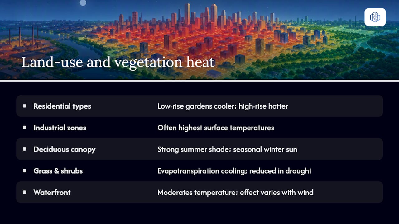
Vegetation type matters as much as vegetation quantity. Mature deciduous canopy provides dense summer shade while allowing winter sun through once leaves drop, a seasonal trade-off that mown grass or low shrub planting cannot replicate. Grass surfaces cool primarily through evapotranspiration, which depends on adequate soil moisture; during drought conditions, a stressed lawn loses much of its cooling benefit and can approach the surface temperature of adjacent pavement. Tree canopy, by contrast, keeps transpiring and shading even when the ground beneath is dry, provided root systems reach sufficient soil volume.
This has a direct implication for zoning and land-use policy: a heat island analysis that treats “green space percentage” as a single undifferentiated metric will miss the difference between a canopy-covered park and a mown verge. Planning frameworks that specify canopy cover targets, rather than generic green space ratios, tend to produce more resilient outcomes. Waterfront and canal-adjacent zones also behave distinctly, since water bodies provide a moderating thermal effect that shifts with wind direction and proximity, a factor worth including explicitly when mapping land-use categories against ΔT results.
Heat islands under a changing climate baseline
Climate change does not create the urban heat island effect, but it raises the baseline that UHI adds on top of, which is why the interaction between the two deserves explicit treatment in any serious analysis. As background summer temperatures rise, the same structural drivers (impervious cover, building density, low sky-view factor) push local peaks further into territory that strains infrastructure and health systems simultaneously.
Extreme heat events are where this interaction becomes most visible. A heatwave that pushes rural temperatures to a manageable level can push urban core temperatures well beyond it, precisely because the heat island adds its own 2 to 9 degree margin on top of an already elevated regional baseline. This compounding effect is part of why national averages, however useful for planning KPIs, understate the risk during the specific weeks that matter most for public health response.
The practical consequence for planners is that mitigation targets calibrated against historical averages may prove inadequate against a shifting baseline. A design that comfortably meets a PET threshold under current climate norms deserves re-testing against a warmer future scenario, particularly for public infrastructure with a multi-decade design life such as schools, care homes and transit stations. Scenario modelling that layers a projected climate baseline onto local UHI structure gives a more honest picture of long-term resilience than a single present-day snapshot, even where that projected baseline carries its own uncertainty.
Keeping measurements trustworthy: validation and calibration
Any hitte-eiland analyse is only as credible as the instruments and models behind it, and validation deserves more attention than it typically gets in project scopes. Satellite-derived land-surface temperature needs ground-rushing against in-situ sensors, because atmospheric conditions, sensor drift and land-cover misclassification can all introduce systematic bias into a thermal band reading.
A basic validation routine checks three things: whether the satellite-derived reading tracks a co-located ground sensor within an acceptable margin across multiple overpasses, whether the sensor network itself has been cross-checked against a reference-grade instrument, and whether the regression model used to link ΔT to structural drivers holds up when tested against a held-out subset of the data rather than the same data it was built on. Spatial autocorrelation checks, mentioned earlier as an analytical step, double as a calibration tool: unexpectedly strong clustering in model residuals often signals a missing variable rather than a genuine spatial pattern.
Mobile transect data carries its own calibration challenge, since sensor readings can drift with vehicle speed, time of day and even the colour of the vehicle itself. Repeating a transect on a control day with known weather conditions, and comparing results against a fixed reference station, is a cheap way to catch drift before it contaminates a full dataset. For any analysis feeding into a public planning decision, documenting this validation step matters as much as the headline temperature figures, since a challenged methodology can stall a mitigation budget as effectively as a genuinely flawed one.
Where heat mapping fits in planning policy
Dutch climate adaptation policy increasingly expects heat risk to be treated as a standard input into spatial planning decisions, alongside flood risk and drought stress, rather than a specialist add-on commissioned after a design is largely fixed. That shift has practical consequences for how and when a hitte-eiland analyse gets commissioned.
Building in heat analysis at the structuurvisie or bestemmingsplan stage, rather than retrofitting it once a masterplan is locked, gives planners room to influence building orientation, street width and green space allocation while those variables are still genuinely open. Retrofitting mitigation into a finished plan (adding trees to an already-narrow street, for instance) usually delivers a fraction of the benefit that the same intervention would have achieved if considered during the massing stage.
Policy frameworks that work well tend to set canopy cover or impervious surface reduction targets as explicit, measurable KPIs rather than aspirational language, precisely because a measurable target is what lets a heat island analysis actually inform a planning decision rather than simply document a problem after the fact. Linking those targets to the zoning and land-use categories already governing a site gives planning committees a concrete lever to pull, rather than leaving greening as a discretionary extra that gets cut when budgets tighten.
Where heat island research is heading next
Modelling approaches are moving from static single-scenario maps towards dynamic, iterative comparisons that let planners test dozens of massing and greening variations before committing to one. That shift matters because the biggest limitation of most current studies, including the national TNO baseline, is that they describe a single measured state rather than a range of testable futures.
Higher-resolution satellite products, more frequent revisit cycles, and better integration between surface and atmospheric datasets are gradually narrowing the gap between what a thermal band can see and what a resident actually feels on a hot night. Combined with denser in-situ sensor networks, some now citizen-deployed at low cost, this is producing finer-grained validation data than was available even a few years ago.
The more significant shift for working planners is procedural rather than technical: heat analysis is moving from a specialist, one-off study into a routine input tested inside the same 3D scenario tools already used for massing, sunlight and visibility work. That convergence, rather than any single new sensor or algorithm, is what will make heat-aware design the default rather than the exception over the coming decade.
Publisher perspective: build heat analysis into the planning cycle, not around it
Commission a hitte-eiland analyse at the structuurvisie stage, not after the masterplan locks in street widths and building heights, because that is where a night-time ΔT reading can still change a design decision. A sound procurement brief specifies data licences, a validation step against in-situ readings, and PET or ΔT deliverables in exportable formats, not a static PDF report. Treat the first analysis as a baseline, not a verdict: repeat measurement, tied to KPIs like the TNO impervious-cover figures, is what turns a one-off study into evidence a municipality can defend at the next budget round.
— Anne Dullemond
Run scenario comparisons for heat risk inside 3D Cityplanner
3D Cityplanner gives planning teams a faster route to testing heat mitigation than switching between separate GIS software, spreadsheets and static PDF reports for every design iteration. Import zoning and land-use layers alongside satellite or in-situ temperature data, build 3D massing for current and proposed states, and compare sun-hour, shade and development-capacity metrics across scenarios in one browser-based model.
The platform’s urban design tools let you generate building massing automatically, run visibility and sunlight analysis across a site, and export KPI dashboards that stakeholders can review without specialist GIS training. For a redevelopment site where reducing impervious cover or adding canopy is on the table, that means testing the TNO-scale effect sizes against your specific street geometry, rather than applying a generic national average to a plan that may behave very differently.
If your team is weighing up software options for an upcoming feasibility study, start a free trial and run your first scenario comparison against a real site before the next planning committee cycle.
Sources
- Exploring the Urban Heat Island intensity of Dutch Cities (TNO data referenced)
- De stedelijke hitte-eilanden van Nederland in kaart gebracht (TNO, 2012)
- Hittestress-analyse Hofplein (project memo)
- Heat island effect | US EPA
- Urban Heat Island: Mechanisms, Implications, and Possible Remedies | Annual Reviews
FAQ
What is a hitte-eiland analyse?
A hitte-eiland analyse maps the temperature gap between a city and its rural surroundings, using satellite surface data and atmospheric metrics such as PET, to identify heat hotspots and their structural causes.
Why is night-time UHI often stronger than daytime UHI?
Dense urban materials absorb heat during the day and release it slowly after sunset, so the urban–rural temperature gap frequently peaks at night even though daytime surface readings look more extreme on a thermal map.
What is the average urban heat island intensity in Dutch cities?
Across the 73 largest Dutch cities, average surface UHI intensity is roughly 2.9°C during the day and 2.4°C at night, with daytime peaks reaching around 9°C during heatwaves.
How much does reducing impervious surface cover actually help?
TNO research found that cutting impervious surface cover by 10% reduces surface heat island intensity by roughly 2.0°C during the day and 1.2°C at night on average, a useful benchmark for setting mitigation KPIs.
What tools help planners test heat mitigation scenarios?
Satellite imagery and in-situ sensors supply the underlying temperature data, while tools such as 3D Cityplanner let teams build 3D massing, run shade and sunlight analysis, and compare mitigation scenarios before committing to a final design.
Does local greening change the city-wide heat island?
Local interventions like the Hofplein plaza redesign can cut local PET by several degrees, but that improvement stays largely local. City-scale UHI generally needs coordinated, larger-area reductions in impervious cover to shift meaningfully.
Recommended
- How to plan urban redevelopment with 3D digital twins – 3D Urban Development
- Practical guide to modern urban planning with 3D technology – 3D Urban Development
- Urban digital twins: enhance planning with virtual cities – 3D Urban Development
- Digital Twin Technology: Transforming City Planning Impact – 3D Urban Development